A MICROSITE FOR AUDIBLE
A MICROSITE FOR PROJECT AMPLIFY
A MICROSITE FOR PROJECT AMPLIFY
THE BRIEF
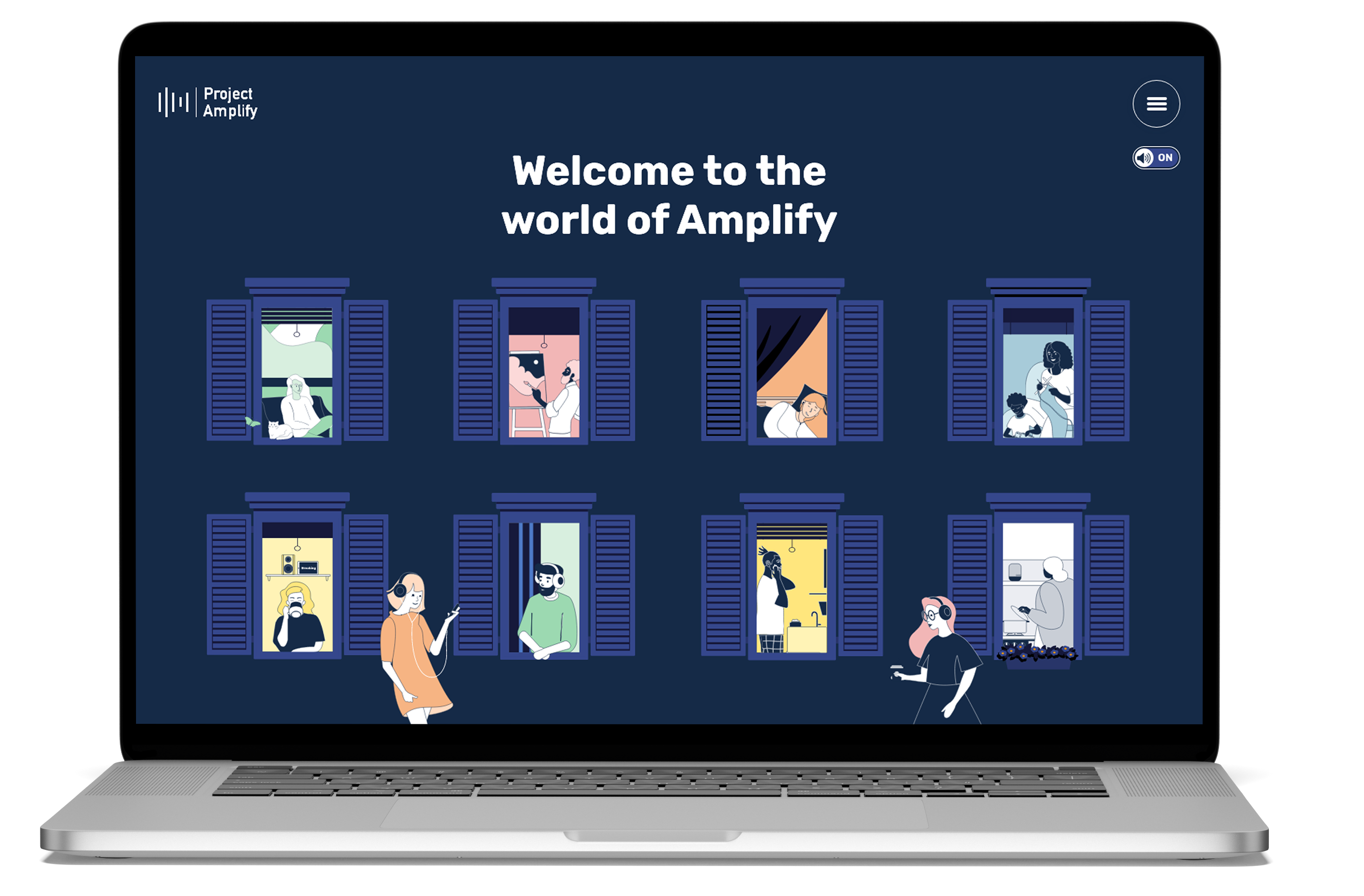
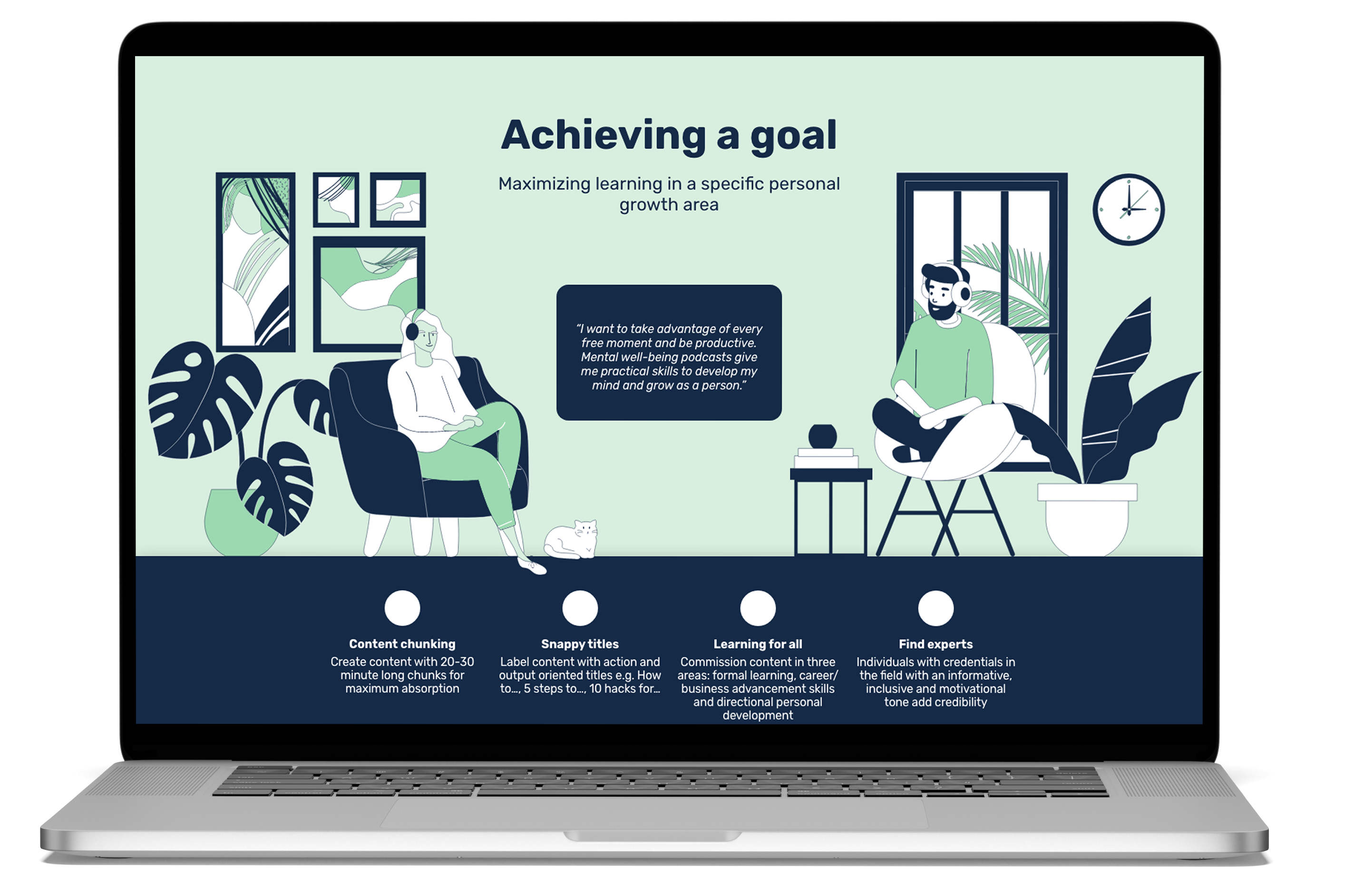
A simple yet effective private website to provide and showcase some of the awesome work Audible are doing behind the scenes.
Designed by Sparkler Ltd; the goal was to create a scrollable solution with sleek animations, clear visuals and informant sounds.
The whole solution was designed for desktop only.


THE SOLUTION
This was one of the first micro site private application Audible have housed and indeed hosted. It was imperetive for Steadweb Ltd to provide a solution that not only met the spec, but was easy to host and deploy. With that in mind, the bare bones of the application was set out to use flat HTML, JavaScript and CSS, only using React as the framework to build the micro site.
In essense, only a handful of open source technologies were used to construct the microsite. Otherwise, pure CSS and JavaScript was used, to simplify the build and deployment process.
Under the hood, the latest features are used to leverage performance, mainly around CSS transitions. The microsite is a single page application, with a sticky scroll element, which leverages css:sticky, similar use cases appear on Apple's website.
Finally, for media, Steadweb Ltd decided to use HTML5 native functionlaity, including audio and video tags, rather than open source JavaScript alternatives.
THE TECH USED

THE RESULTS
An easy to deploy, static HTML, JavaScript and CSS website, hosted on AWS (S3) via CloudFront. For development, Amplify was used to accelerate this.
Take a look at the site using the link below.